Authentic traveling with friends
Encharted is a NY based startup with core idea to combine friendship trhough social media and authenticity throught travels provided by ]
Project agile process
User & Market Research
Clickable lo-fi prototype
Visual design & Design system
Vibecode
During exploration phase I focused on finding main users needs and problems; as well as analyzing products on market.
The core insight I found, which shaped the product, was that across very different user groups and lifestyles globally, there was one frequent common problem — a lack of a supportive, relatable environment to maintain a lifestyle change.
After the research, I was brainstorming how to solve this problem in a way that is both simple and emotionally pleasant for users. And also integrates seamlessly into the processes people already follow in this area of life.

skethes ✏️ from brainstorm session on core logic of app
segmentation of user groups based on 📁 ux research
Health- & Wellness-Oriented Groups
Lifestyle & Habit-Driven Groups
Trend & Innovation-Driven Groups
Life Stage & Demographic-Driven Groups
Socio-Economic & Behavioral Groups
secondary research data points
60% of adults say they don’t have time to cook regularly
~75% of adults don’t eat enough vegetables
1 billion people globally live with obesity
15–20% of people show addictive-like eating behavior
50% of adults lack basic nutrition literacy
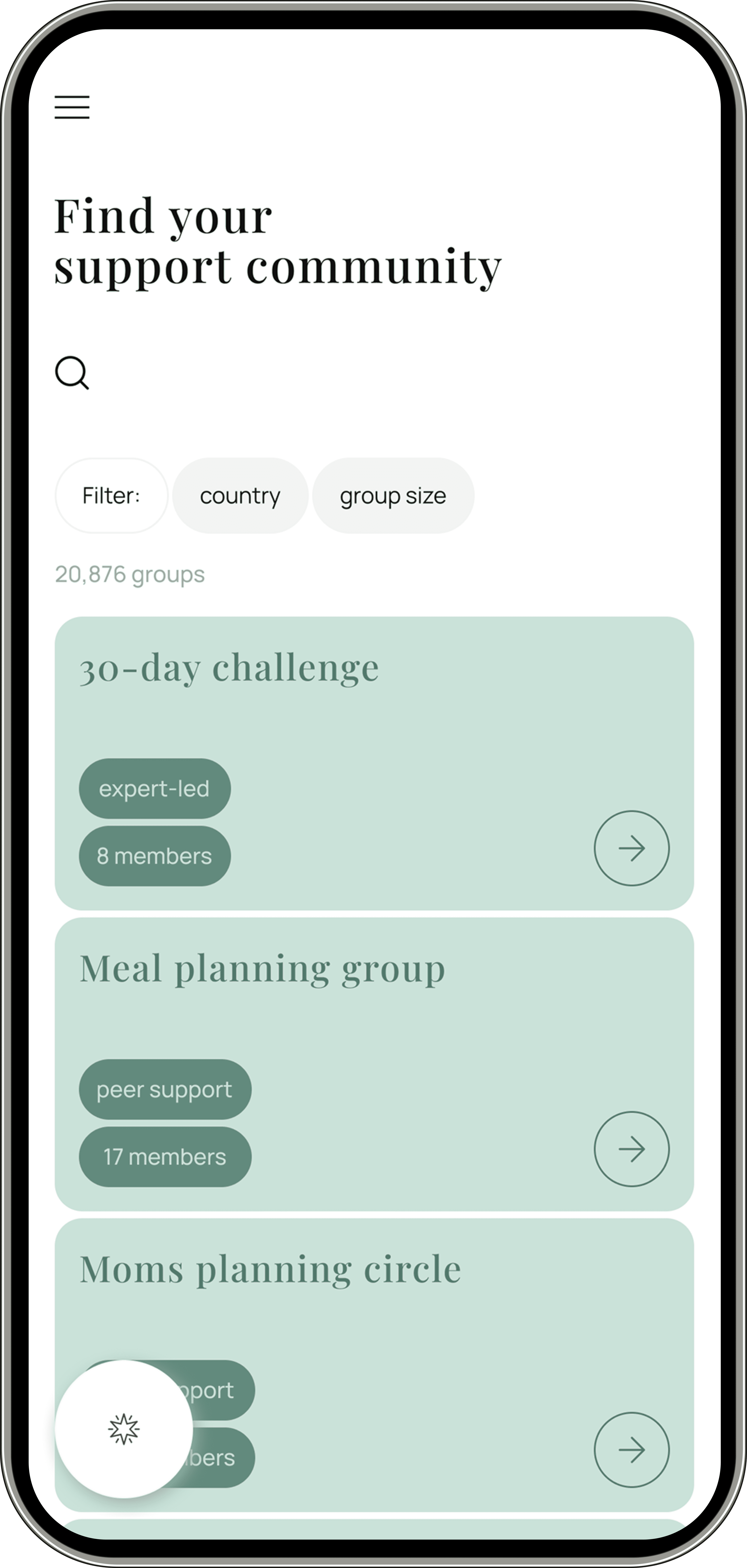
While forming user flows with wireframes, I came up with the idea of custom modules for communities, allowing them to be modified for group-specific needs, as well as complex filtering to help users find the right group.
For example, vegetarian-focused groups or groups for mothers planning family meals—led by experts
or experienced enthusiasts. AI guides users through the app and adapts to their goals.
So, while the app looks very simple, it still allows us to effectively
meet the needs of very different user groups.


Working on visual solution, I focused on making the app highly intuitive and accessible, as users come from diverse cultural backgrounds. The interface follows a minimalist approach with clear accessible hierarchy, spacing, combined with a friendly tone and soft color palette.